
Opus
Every student's ultimate productivity tool.
Opus is a web app streamlining academics tasks from multiple apps into a single to-do list. You tell us what you use, and we keep you focused on what's most crucial.
And using it is as easy as 1, 2, 3.

Integrate Your Platforms
Input Tasks


research & ideation
Context
This project was done for the Product Association Fellowship at UCI. I and my cross-functional team have all felt the frustrating experience of having disorganized to-do lists spread across multiple notebooks/platforms whilst battling with our memory of future tasks. Let’s explore this frustration further… through research!
[research-time]
I first did some empirical research to explore possible psychological behaviors that lead to task lists becoming inefficient. I came across one Reddit user who brought up the theory of "analysis paralysis". The theory goes like this:
Trigger
Realizes that there is work to be done.
Record
Tries to figure out what tasks need to get done and records them mentally/physically.
Analyze
Analyzes the tasks to see which are most significant but struggles to decide.
Paralyze
Feels overwhelmed with the amount of tasks and its urgency for each of them, resulting in the paralysis of never starting.
"Shoot, I need to start focusing"
"Let's spill everything out first"
"I don't know where to start"
"Let me tackle this another time, when I'm less stressed"
The theory of analysis paralysis seems all too familiar among college students and must be addressed.
Findings
[further-research]
After interviewing 5 university students across the nation with varying majors, and surveying 60+ people, I learned that the issue is not the tools students use to keep track of tasks, it's their technique of organizing tasks.
one of the techniques our interviewee had was…

why do these techniques not work?


it's too overwhelming
All techniques lead to some form of analysis paralysis.
Students waste time organizing
Students forget/avoid tasks rather than completing them
the problem
How might we help college students save time on keeping track of their assignments and effortlessly push them (use that time) to take action instead?
7 solution spaces
20 feature ideas
initial solution
A to-do list web app that utilizes an efficient task input flow and flashcards to have users focus on the today-tasks while keeping the rest out of sight and in the backlog.
Our Thoughts
After intensively analyzing our research, we concluded that having our users pick out and complete just a few tasks first is much faster than ranking all tasks at once. Once you want to pick out the next few tasks, your priorities will most likely have changed anyways.
This prevents the analysis paralysis from occurring, giving users more time to get work done, one at a time.
Or so we thought … (more on that later).
the MVP
Consider the Edge Cases
I used our research insights to draw up the MVP (minimum viable product) flow, or core user flow, and experience of our product's mission.
Because the product's concept is very simple, I needed to prioritize the edge cases instead of the happy path. In what scenarios would this flow become less and less ideal in maximizing the user's efficiency?
1] When the users are not in the ideal conditions to create a task with precision
[less-than-ideal-scenario-1]
Iterating: Text Input Flows
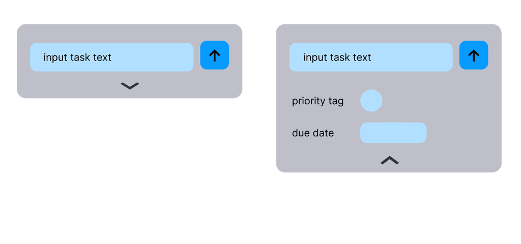
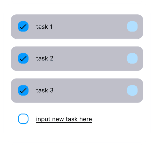
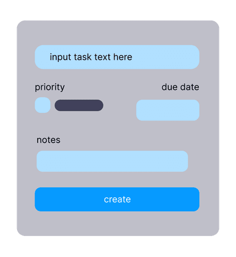
I cannot control the conditions users are placed in, but I can make the process of creating tasks as frictionless as possible. To do this, I ideated low-fi mockups of different text-input flows utilizing various mobile design patterns:
I need it fast & functional.
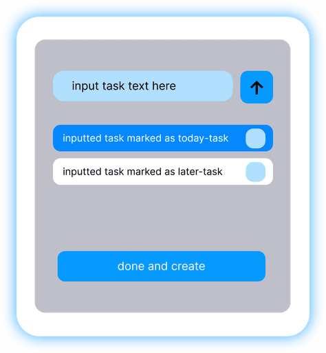
I decided to go with the 4th iteration using a pop-up modal mobile design pattern, where the flow only requires three CTA clicks. This is because:
A separate dialog that's large removes surrounding distractions allowing for easier focus
The user can input multiple tasks with less confirmation taps for a quick braindump
Less time and thinking is required if there is a binary decision of the task being done "Today" or "Later" rather than specifying a priority, date, and/or notes
2] When the user wants to add extra tags or due dates to the tasks they create
[less-than-ideal-scenario-2]
Iterating: User Flows
We knew that due dates and calendars would eventually be a desired feature for our product. So I drew up some potential user flows with and without these extra features.

with extra features

without extra features
KISS (keep it simple silly)
After showing these user flow visuals to Jasmine (the Project Manager) and Ethan + Gayathri (the Software Engineers) , we realized…
These extra features are not technically feasible within the timeframe
Implementing varying time/date options deters from the main goal of making to-do lists as streamlined as possible
Let's keep it simple but make our product scalable for future implementations like these. Thus, we went for the core user flow without extra features.
The Issue
Although we settled on the main task-input flow and core user flow, there was an issue. From mentor feedback, we understood our product wasn't unique enough to convince users to abandon their previous methods.
SO LETS UP THE ANTE AND PIVOT
re-ideation
Let's Consider These Tools
We went back to our research data and missed a crucial frustrating pattern in it — despite people's varying techniques they all had to abide by the school tools their forced to use (Canvas, Aleks, etc.) where these tools contain their own creation of homework assignments and tasks.
This is evidenced by a previous user interview with a student from UCSD:

So let's bring the tools/softwares to them instead and take care of it for them…
The Solution
Integrating academic platforms into our web app that transforms our tool into every student's one-stop shop of everyday tasks.
design decisions
Finalized Ingredients
We're 7 weeks into the project and I can finally finish my designs now that I have synthesized and boiled down my finalized ingredients:
👯 Binary Organization
[one-cup]
I decided to remove the extra features of dates and tags to our tasks and kept it to a binary organization of a "Today" or "Later" task. This is to maintain a efficient task-input flow that can be done in as simple as 3 CTA's.


🃏 Flashcards Maintain Focus
[two-tablespoons]
To ensure our users maintain focus in completing tasks, we ideated to display tasks in a flashcard view. This forces users to first view their tasks only one at a time to reduce the analysis paralysis and feel a sense of achievement in removing a task flashcard when completed.


Let's Still Give Viewing Options
From the 5 usability testing sessions and 2 heuristic evaluations, I learned that a list view for the Today tasks is still necessary for those who would like to see their tasks holistically. However, to maintain the focus from the flashcards, I made the list view invisible unless scrolled down. This is to reduce space intake as well.


✅ Integrated Tasks
[three-scoops]
Integrated tasks from the users' linked academic platforms should stand out. Thus, I added a logo, additional information to the task, and additional functionality!


the results

lessons
Research is key in ALL stages.
Our user research was our saving grace in us being confident in our product and thus, creating an impactful and meaningful experience and product.
Simplicity leaves room for iteration and greater quality.
Starting with a simple concept allowed us to prioritize the edge cases, creating more assurance for a greater quality product.
Two minds is better than one.
Building a product from 0 -> 1 meant I needed to communicate constantly with the software engineers to ensure the design can be feasibly made. Understanding these limitations pushed my design boundaries.

